Alpine Answers
User ExperienceUser Interface DesignDevelopmentThe Challenge
I was approached by Alpine Answers with the challenge to redesign their corporate website. They are Ski Holidays specialists and promote hundreds of Chalets and Hotels across most winter resorts. The website was functioning as expected but was showing its age and it required a visual upgrade.
One of the main challenges was the amount of existing content due to the SEO strategy already in place. Just had to find different and innovative ways to display it.
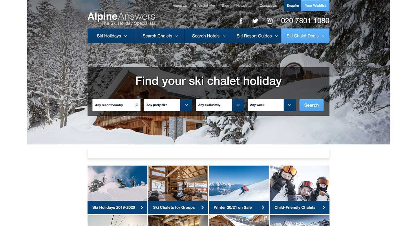
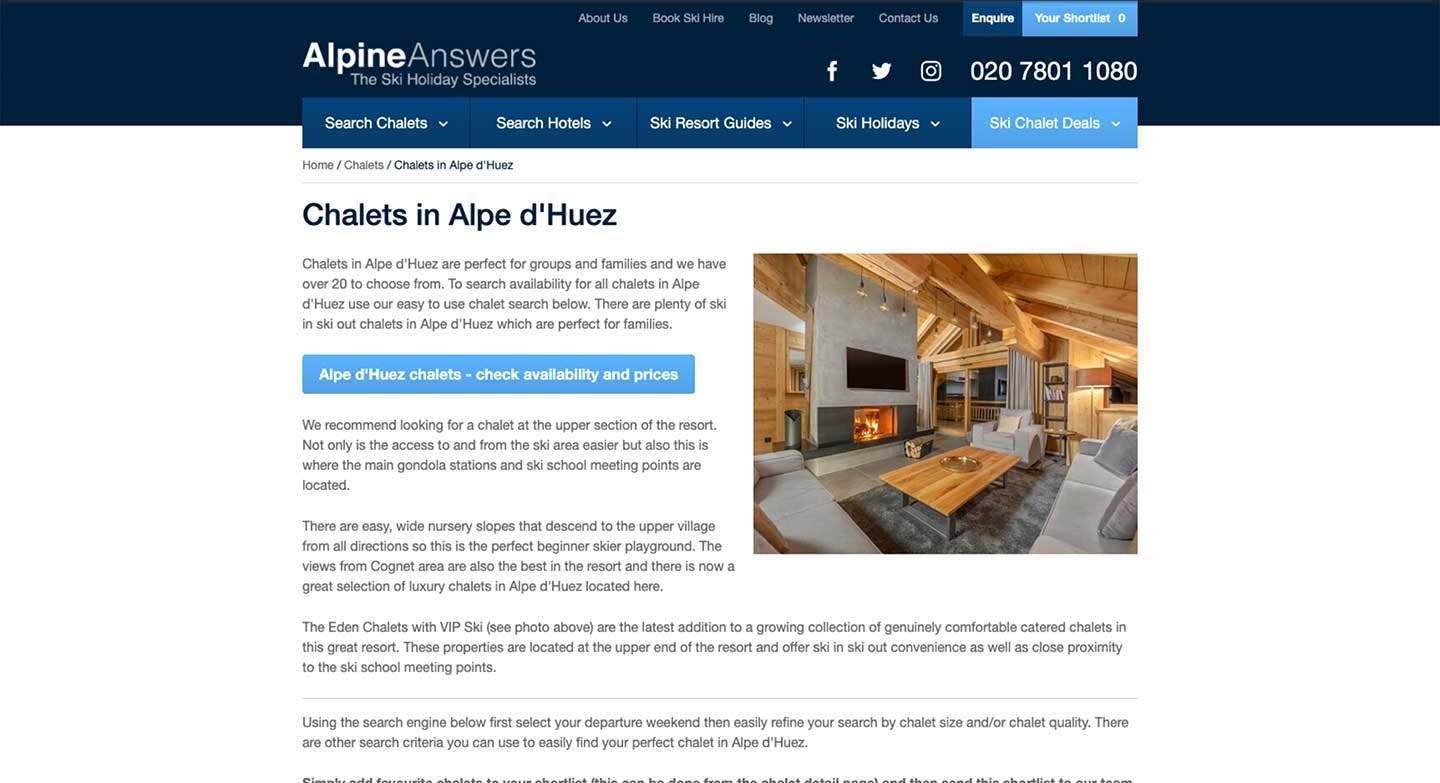
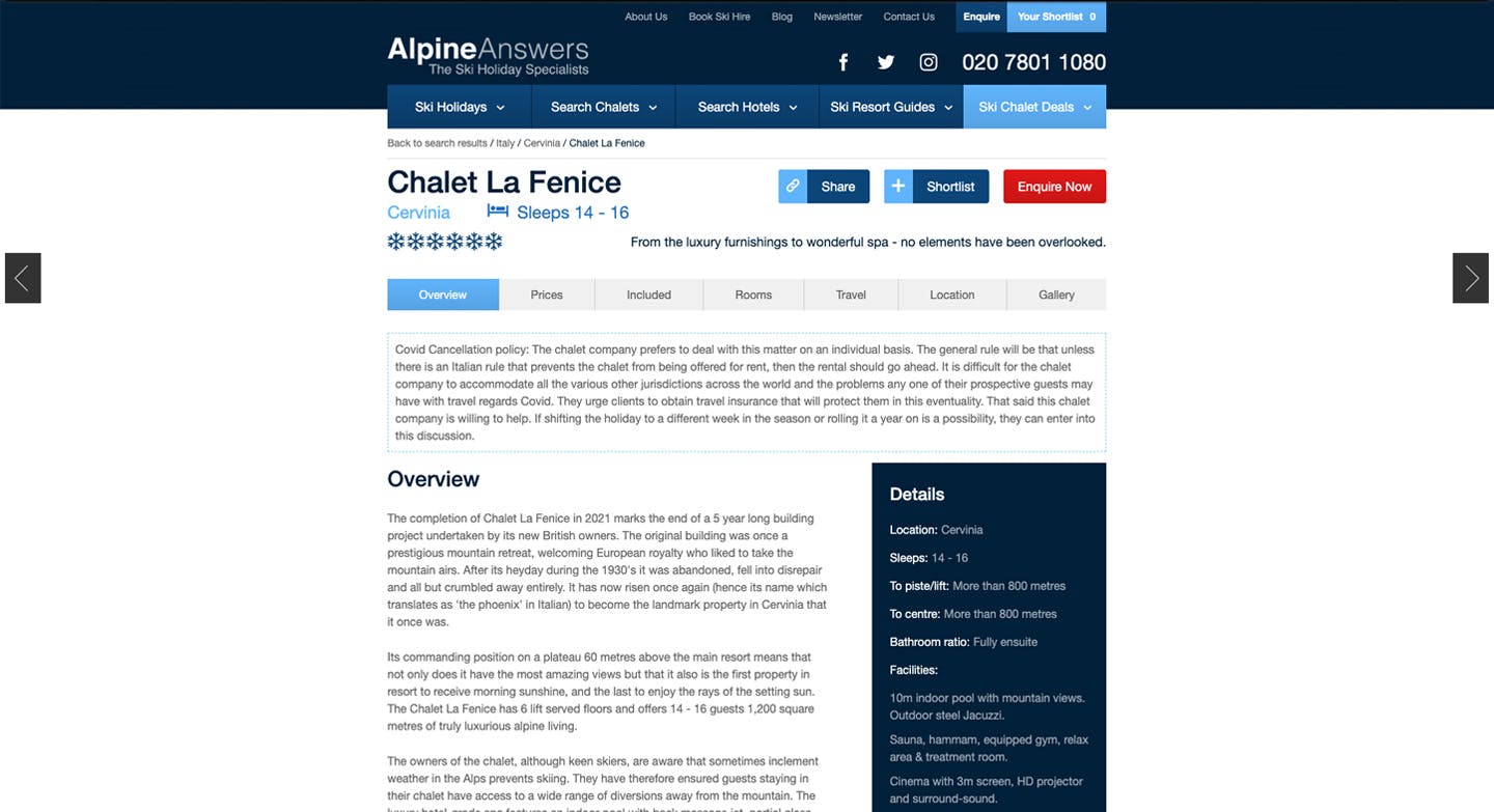
Before
The Process
After a full audit to identify what was working and not (both from a visual and performance perspective), I've identified things we could do to improve the overall user experience and promote the different locations.
The main ones were that the website was held on a very small "container", showing large "white bars" on each side of the screen. The initial landing area was mainly occupied by the search and did not add much about the business or top locations. Also, most pages were quite heavy on content and lacked some visual engagement.
The Homepage
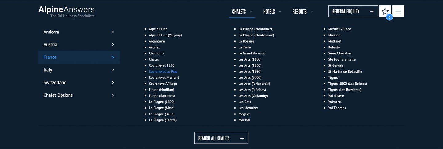
For the homepage, I've designed and developed a full-screen dynamic slider, scrolling through the top locations and information about them. It helps the user understand the offering and quickly navigate to the preferred options. Alternatively, users could use the top navigation, always in view, to find a specific location or resort.
I've also introduced a few interactive elements like the "For Everyone" section, where users can easily find properties that are suited to their goals.
The Chalets and Hotels blocks were made consistent across the website

Improvements
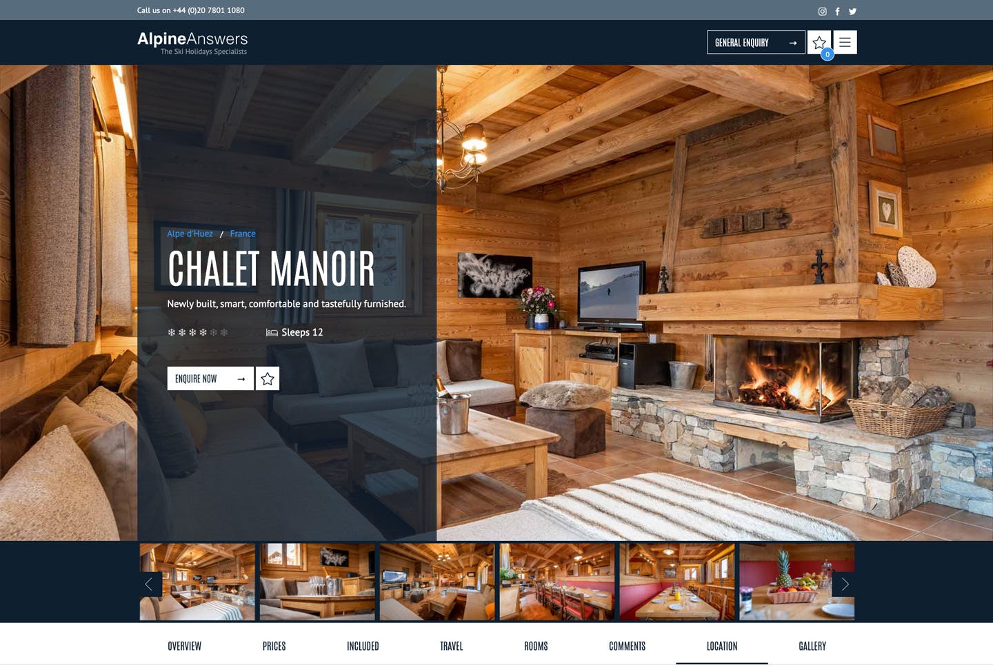
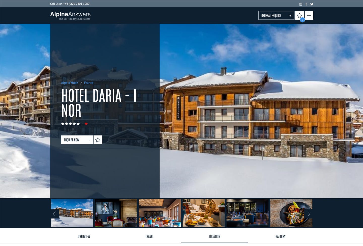
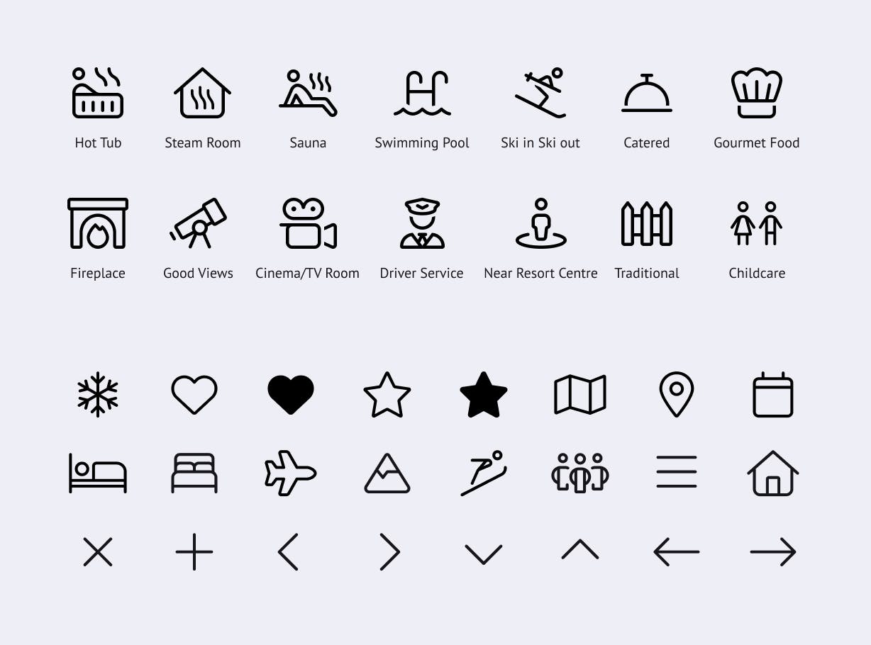
Taking advantage of the amazing photography, previously hidden behind a gallery, the templates for the Resorts, Chalets and Hotels now display a full-bleed image with the relevant information on top. New iconography was introduced for all the Chalet features and services, to help the users get familiar with the terminology.
